

Customizing UI Theme
Customize the SolidX light and dark themes using theme variables and project-level style overrides.
This recipe documents the implemented SolidX theme customization flow.
After @solidxai/core-ui is installed into a boilerplate app, SolidX theme customization is primarily done by editing the copied theme files under public/themes/.
How SolidX Theme Loading Works
SolidX switches themes by updating the stylesheet link with id theme-css.
- Light mode loads
/themes/solid-light-purple/theme.css - Dark mode loads
/themes/solid-dark-purple/theme.css
Each theme.css file imports a matching theme-variables.css file:
/themes/solid-light-purple/theme-variables.css/themes/solid-dark-purple/theme-variables.css
Theme Files
theme.csscontains component styling rulestheme-variables.csscontains the design tokens you are expected to customize
Which Files Should Users Edit?
After the package assets are copied into your boilerplate app, the main files to edit are:
public/themes/solid-light-purple/theme-variables.css
public/themes/solid-dark-purple/theme-variables.css
If your boilerplate has these copied theme files or the public/themes folder in .gitignore, remove those ignore entries first so your theme changes are committed to git.
Recommended Starting Point
In most cases, do not start by editing theme.css directly.
Use theme-variables.css for:
- Brand colors
- Background and surface colors
- Text colors
- Border colors
- Sidebar colors
- Focus ring colors
- Card and dashboard colors
Use theme.css only when you need to change actual component-level styling such as:
- Spacing
- Border radius usage
- Special hover states
- One-off PrimeReact overrides
- Custom component rules that tokens alone cannot cover
Recommended Customization Flow
1. Update the brand colors first
In both variable files, start with the core tokens:
--primary
--primary-foreground
--primary-color
--primary-color-text
These usually affect buttons, active states, links, highlights, and selected UI states.
2. Adjust the surfaces
Update the base backgrounds so the app feels correct in both modes:
--background
--foreground
--card
--card-foreground
--surface-ground
--surface-section
--surface-card
--surface-overlay
3. Tune borders and muted text
These tokens control readability and visual separation:
--border
--surface-border
--text-color
--text-color-secondary
--muted
--muted-foreground
4. Customize sidebar and layout tokens
If your app needs custom navigation branding, update:
--sidebar-background
--sidebar-foreground
--sidebar-border
--sidebar-accent
--sidebar-primary
--sidebar-primary-foreground
--solid-sidebar-width
5. Review mode-specific tokens
Some tokens are intentionally different between light and dark mode. Keep reviewing both files together so contrast stays healthy.
Examples:
--solid-login-bg-color--highlight-bg--highlight-text-color--icon-color--solid-dashboard-welcome-bg
Example: Change the Brand Color
If you want to replace the default purple brand with blue in both themes, you can use values like these:
Light mode example:
--primary: #2563eb;
--primary-foreground: #ffffff;
--primary-color: var(--primary);
--primary-color-text: var(--primary-foreground, #ffffff);
--ring: rgba(37, 99, 235, 0.35);
Dark mode example:
--primary: #60a5fa;
--primary-foreground: #08111f;
--primary-color: var(--primary);
--primary-color-text: var(--primary-foreground, #08111f);
--ring: rgba(96, 165, 250, 0.35);
Important Notes
Keep Both Theme Folders in Sync
If you add or rename a token in light mode, make the same change in dark mode too. Missing tokens often cause inconsistent UI rendering.
Prefer Variable Changes Over Selector Changes
If a visual change can be done through theme-variables.css, do that first. It is easier to maintain and safer during upgrades.
Be Careful With Contrast
When changing dark mode, verify:
- Text is readable on cards and panels
- Borders are still visible
- Hover and selected states are still obvious
- Focus rings are visible for keyboard users
The mode is persisted
SolidX stores the selected mode in local storage under solidx.theme.mode.
It also updates:
- The
darkclass ondocument.documentElement - The
data-themeattribute withlightordark
When Should You Edit theme.css?
Only edit theme.css when token changes are not enough.
Typical reasons:
- A specific PrimeReact component needs a custom style
- Toolbar, dropdown, or editor states need extra overrides
- You want a structural style change, not just a color/token change
If you do edit theme.css, keep the @import line at the top unchanged so the variable file still loads correctly.
Best Practice for Teams
- Treat
theme-variables.cssas the main branding layer - Keep light and dark changes side by side during review
- Test headers, sidebar, forms, tables, dialogs, and auth screens in both modes
- Re-apply or compare customizations carefully when upgrading core-ui versions
Summary
For most SolidX theme customization:
- Edit
public/themes/solid-light-purple/theme-variables.css - Edit
public/themes/solid-dark-purple/theme-variables.css - Avoid changing
theme.cssunless you need component-level overrides - Test both light and dark mode after every theme change
Class-Based Overrides
If token changes are not enough, you can also override SolidX classes in your own custom stylesheet for targeted customization.
Two common options are:
- Create a separate stylesheet such as
solid-custom.cssand import it from your app entry point - Add the overrides directly into your app-level
index.css
This is usually a better approach than editing theme.css when you want project-owned class overrides that should stay clearly separated from the copied SolidX theme assets.
Screenshot Example
It helps to include an "after customization" screenshot here so readers can quickly see the effect of the overrides on areas like:
- Sidebar active row styling
- Hover state styling
- Removed container shadows
- Header or breadcrumb appearance
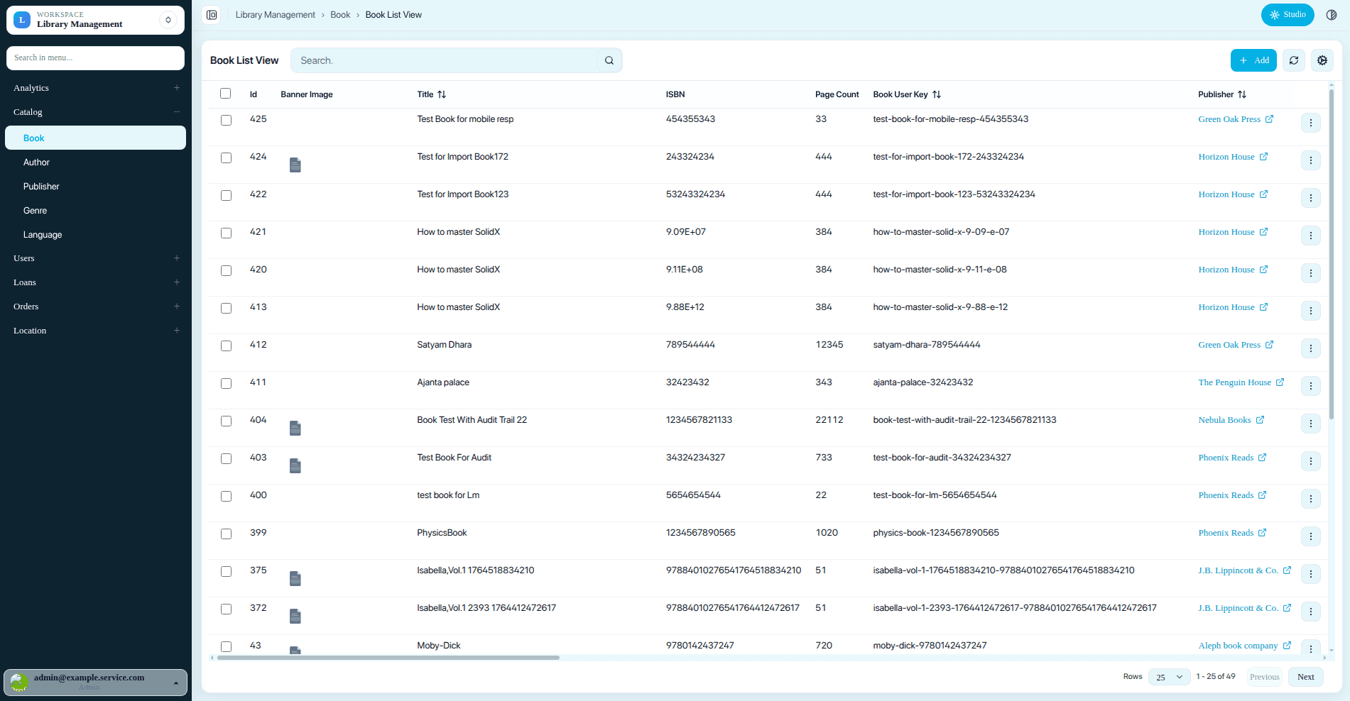
Example of SolidX UI after applying custom sidebar row, surface, and header overrides.
Light theme variables used for this example:
--primary: #03b1e4;
--accent: #e6f7fc;
--background: #e6f7fc;
--sidebar-background: #0e2330;
--sidebar-accent: #e6f7fc;
Example:
.solid-sidebar-tree-label {
  color: #FFFFFF;
}

.solid-sidebar-tree-row:hover .solid-sidebar-tree-label {
  color: #03b1e4 !important;
}

.solid-sidebar-tree-row.is-active .solid-sidebar-tree-label {
  font-weight: 600;
  color: #03b1e4;
}
Use this approach for cases where you want to fine-tune specific rendered UI elements such as sidebar rows, headers, breadcrumbs, shadows, or other component-level presentation details that are not covered cleanly by theme variables alone.
Recommended pattern:
- Keep color and surface tokens in
theme-variables.css - Keep copied framework theme assets in
public/themes/... - Keep project-specific class overrides in
solid-custom.cssorindex.css
That separation makes upgrades easier because your custom class overrides stay in project-owned files instead of being mixed into copied theme assets.